|
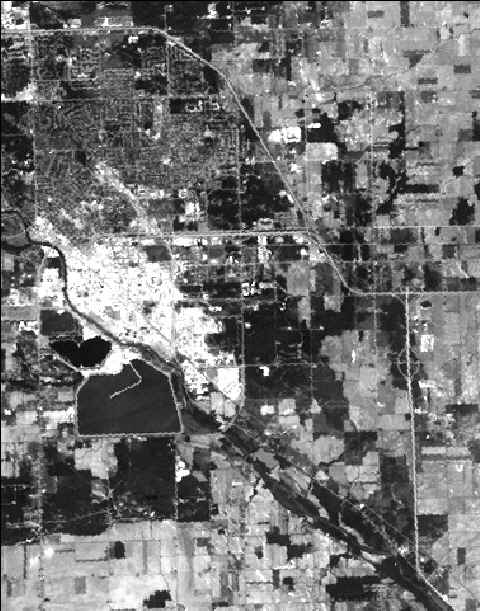
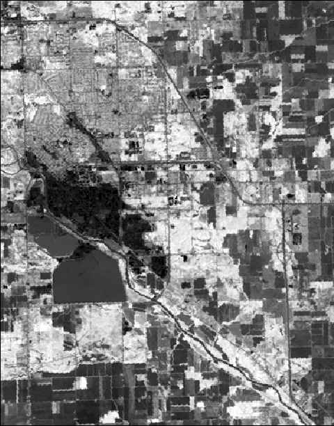
1 Image 1. This is
principal component 1 (PC-1) of the three visible bands. It looks
pretty much the same as any of the three bands viewed individually in
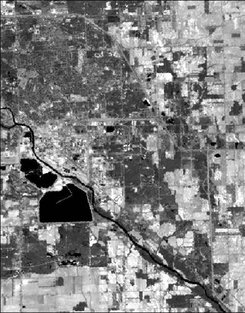
grayscale. Image 2. This is
principal component 1 (PC-1) of the two middle-infrared bands. It
looks pretty much the same as either of the bands viewed individually in
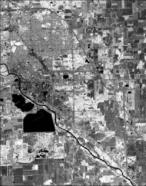
grayscale. Image 3. This is
the original Thematic Mapper Band 4 (near-infrared). Vegetation is
light-toned because of its high response in this region of the
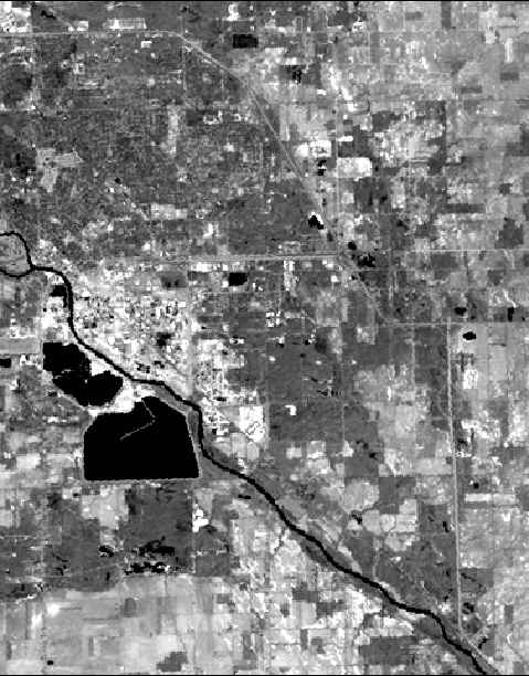
spectrum. Image 4. This is
the soil brightness index (SBI). As you can see, the lightest-toned
features are the open urban areas and the bare agricultural
fields. Image 5. This is
the green vegetation index (GVI). As you can see, the forests are
much lighter than the surrounding features. This image is almost
like a negative of the soil brightness index shown above (Image
4). Image 6. This is
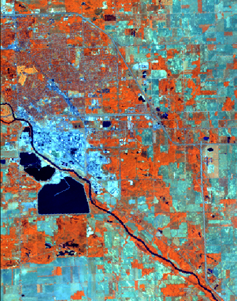
the merged image with the five layers of spectrally enhanced data.
It is displayed here in true color with layers 2,4,1 (RGB). This
means that TM Band 4 (near-IR) is in the red color gun, the soil
brightness index (SBI) is in the green, and PC-1 of the visible bands is
in the blue. I think that this image is interesting because it shows
how the various types of features all have quite distinguishable
signatures. Notice especially how well the Country Club, the
industrial district, and the water features stand out. |